Your Cart is Empty
Buy a book, plant a tree.
Lined with bespoke furniture solutions, this miniscule London home is a response to our ever-shrinking urban living spaces

"It was like designing the interior of a boat or a caravan," say designers Nina Tolstrup and Jack Mama of this quirky, plywood-lined 13 square meters (140 square feet) house in north London. The husband-and-wife team, founders of Studiomama, devised this ingenious scheme to bring a new lease of life to an old and awkwardly shaped building that had previously been used as a mini cab office.

"As space becomes more of a premium, we have to rethink how we live and how we organize our living spaces," says Mama of the inspiration for the project. "There's a new generation seeking out different ways of facilitating putting a roof over their heads, whether that's mico-living, co-living, or alternative dwellings such as houseboats."

Thanks to Studiomama, this tiny home now boasts a double bed, sufficient storage, comfortable seating, a standing desk, kitchen and dining area, and a bathroom. All furniture is composed of separate units, each with its own function, and had to be custom-made by design and fabrication studio Commissioned by You.

"We have created small spaces before, but this was a great challenge as it is impossible to get a project like this to work using any off-the-shelf furniture," says Tolstrup, who, in collaboration with her husband, designed an array of integrated solutions to help make the home as habitable as possible, such as sliding, folding, pull-out, and flip-up elements. "We see the issue of how to live in a compact space to be of growing importance," she adds. "Especially given the trend toward urbanization and the rise of megacities, and we wanted to use the project to question what we really need to live comfortably."

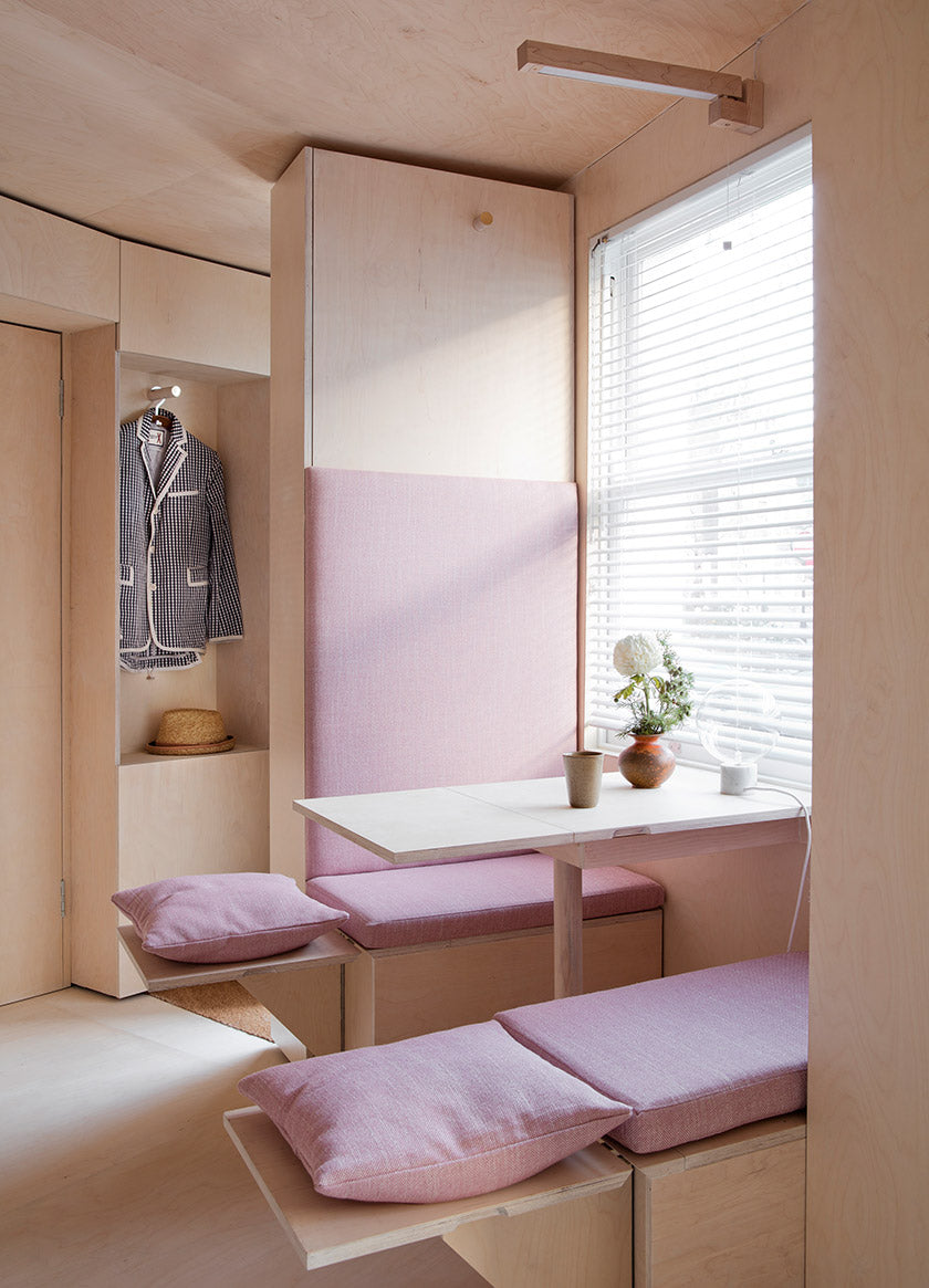
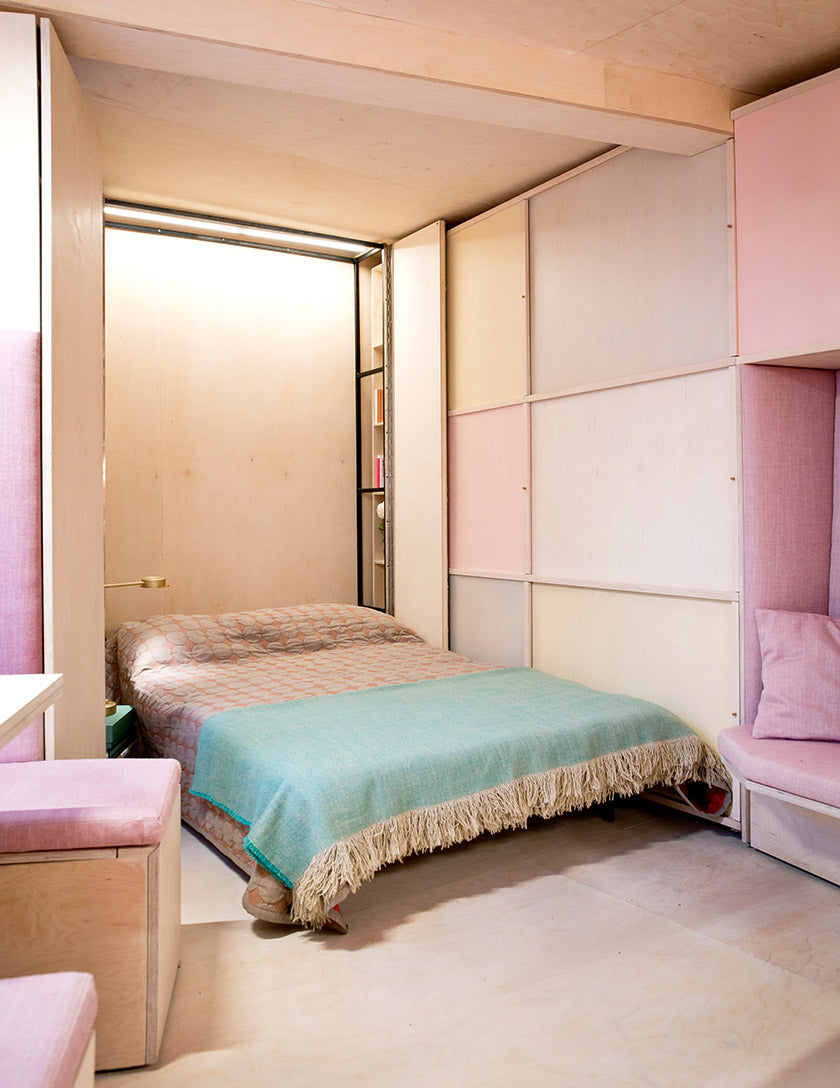
Other than the separate bathroom, every need is catered for in one room, which is lined with recessed shelving, hidden storage, and built-in seating. A cozy upholstered banquette by the window provides space to dine and features an extendable table plus extra seating that folds away when not in use. Opposite, a sofa nook has its own storage ottoman that slides out to act as a footstool. A compact kitchen fills one side of the space, while at the narrowest end, a double bed folds out of a cupboard revealing internal bookshelves and a nightstand.

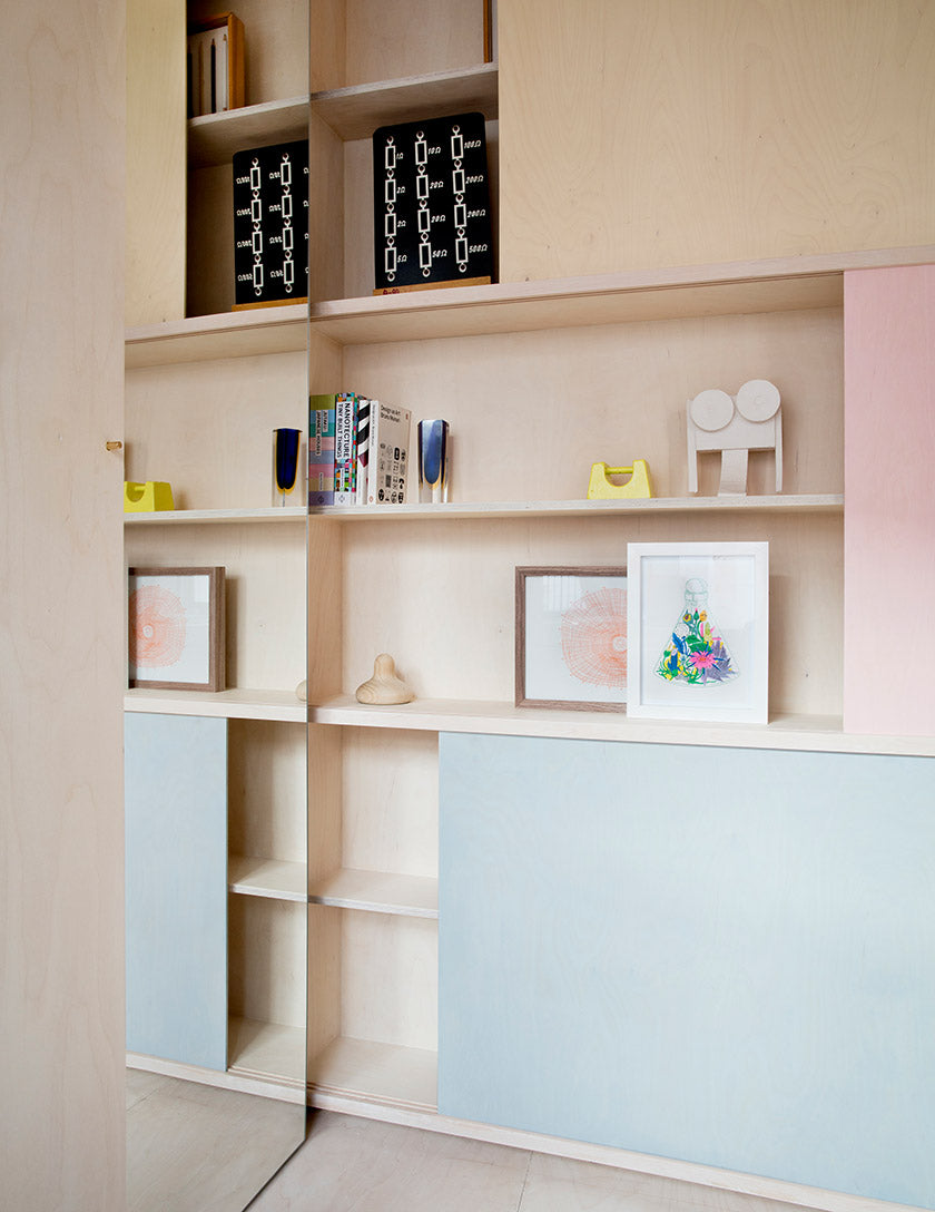
Sliding doors tinted in pastel tones of yellow, pink, and blue conceal cabinets throughout the space, each of which is designed for storing specific items, from a sewing machine and games to spice jars and wine. Discreet use of mirrors makes the tiny room feel bigger, while considered lighting adds warmth and depth to space.
Browse through Petite Place–Clever Interiors for Humble Homes to get inspirations on how you can add striking changes to your modest home with only a few tweaks.