A New Age For Branding Where Charities Are Setting The Pace
The brands of today aren't like they used to be, instead of targeting trends and consumers, they speak to people and want to bring about change
Neoliberalism has helped feed our landscape of entrepreneurs and designers creatively battling it out for new customers or trying to retain the community they have. We are living in the golden generation of branding and visual identity, where one breakthrough can make you famous and more importantly, stand out in an ocean of competition and content.
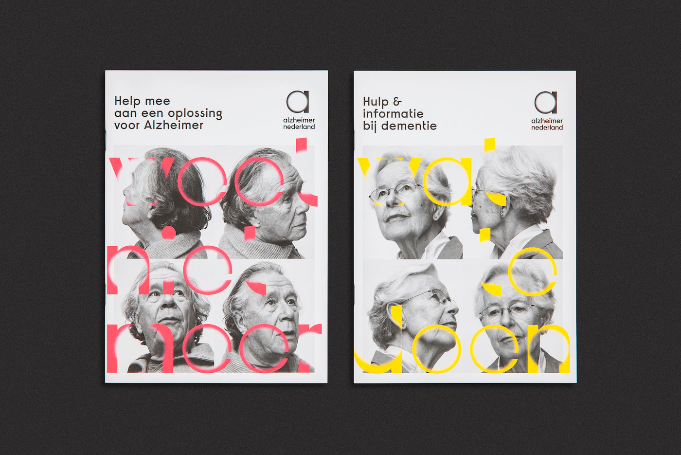
Alzheimer Nederland was up against several other competitive charities who wanted to get their message heard. They worked with Studio Dumbar to successfully reinvent their identity and reach their audience emotionally. (Photo: Studio Dumbar)
Information is no longer enough, you have to be playful and be storytellers to reach your audience on an emotional level. Charities and non-profit organizations have become leaders in this movement despite not having the resources or savvy communication expertise of multinationals or some start-ups. With this in mind, we shine the light on the organizations raising the bar for branding.
It is true that today's brands are not what they used to be. They are continuously working in new and creative ways to stand out and be better. There is a new era of branding the world over. We are seeing the industry being shaken-up, stereotypes are being broken down, and organizations now have a clean slate to propel their messages after decades of discrimination or negative connotations.
Competition within charities is fierce, raising funds and awareness is crucial for survival and cause
Healthcare, LGBTQ+ communities, and charities through clever and colorful campaigns, plus new visual identities, are able to get their message out there and reach new audiences like never before. International agency Studio Dumbar worked with Alzheimer Nederland to raise awareness and funds for vital research on the subject, which currently presents one of the toughest challenges to the human race.
Alzheimer's is the most common type of dementia, which is a general term for a decline in mental ability that interferes with daily life. Alzheimer's accounts for roughly 60-80% of dementia cases. It can reduce a person's ability to perform everyday activities and symptoms can lead to an early grave. Studies in America indicate it is the sixth leading cause of death, roughly 16 million people are affected.
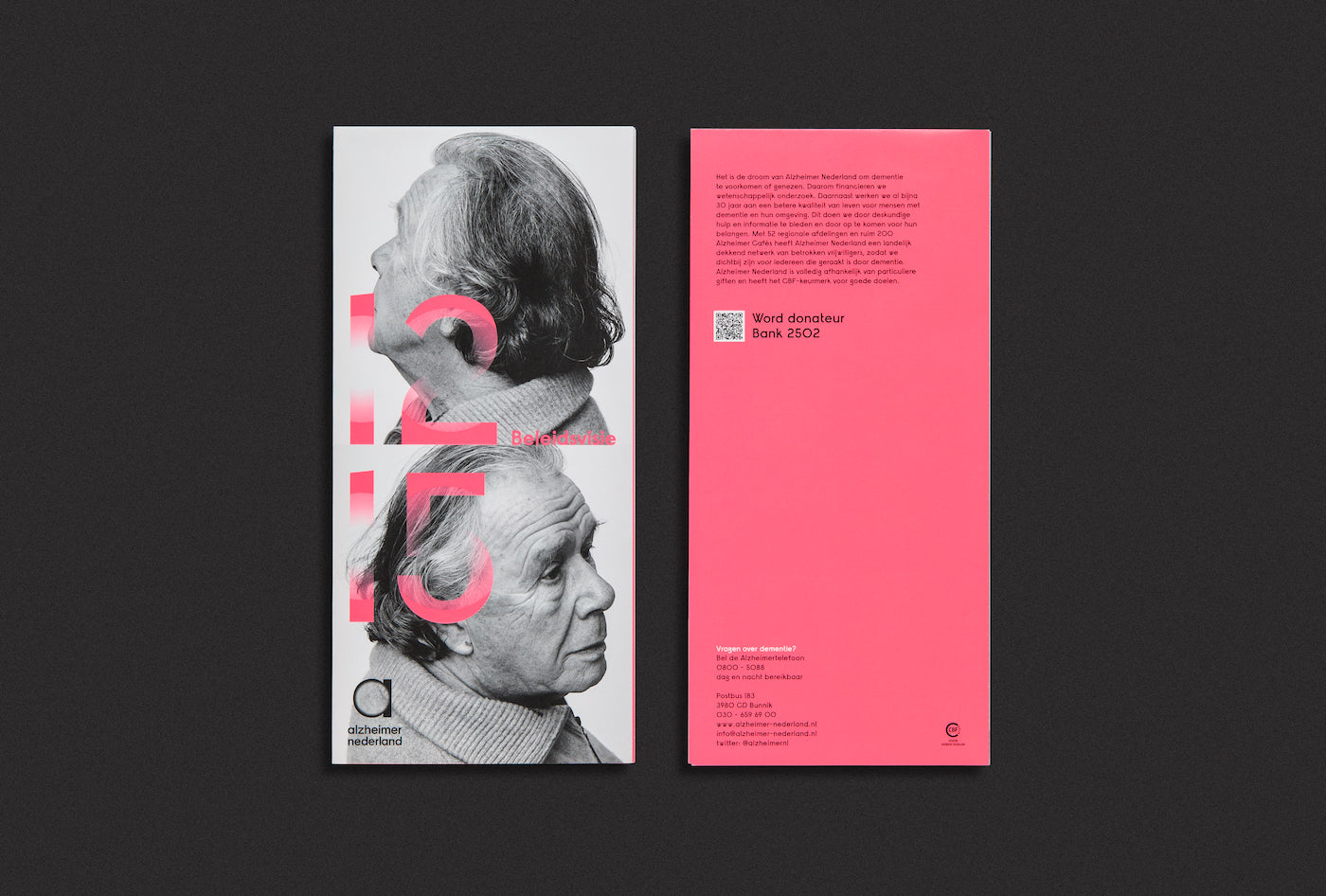
Alzheimer Nederland and Studio Dumbar wanted to create a powerful message but didn't want to seem like a completely new organization and lose its current community in the process. The new identity had to be well considered to attract and retain a larger audience. (Photo: Studio Dumbar)
Alzheimer’s and other forms of dementia have edged closer into the public domain in the past decade. Once it was an issue people, families, and workers didn't want to discuss or acknowledge through fear of embarrassment or lack of understanding, today it is a real issue that many people will encounter at some stage in their life.
Alzheimer Nederland lacked cutting-edge design or style to touch their audience emotionally, so they worked with Studio Dumbar on new ways to communicate their message. Competition within charities is fierce, raising funds and awareness is crucial for survival and cause. Both parties knew gaining sympathy was crucial. Studio Dumbar said, "Our priority for Alzheimer Nederland was to speak to people’s hearts in a powerful way, but also quietly, without shouting–with impact and integrity."
Studio Dumbar managed to create a new visual identity that built rapport with those suffering from the disease. To this day they still receive comments on how people 'feel an immediate emotional connection with the identity'
The design team working on the project met families, patients, and carers to learn more about the disease first-hand. They instantly developed a strong recognizable identity from talking to those dealing with the disease.
The new identity was confident but not offensive, approachable instead frightening, and the new typography made it easily recognizable to all demographics. Alzheimer Nederland brought themselves into the modern world of branding through this crucial new campaign. (Photo: Studio Dumbar)
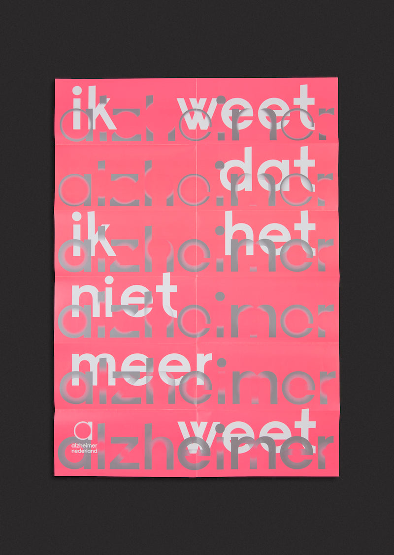
… the logo is blurred, fading in elements within the typographic style–helping to visualize the effects of the disease. Some people have seen this as a source of light and hope
The creative team at Studio Dumbar went beyond what the eyes can see for their new identity because just like the human mind, things always change. The new logotype was bold and confident but also consisted of 'vanishing points.' This means the logo is blurred, fading in elements within the typographic style–helping to visualize the effects of the disease. Some people have seen this as a source of light and hope.
Studio Dumbar managed to create a new visual identity that built rapport with those suffering from the disease. To this day they still receive comments on how people 'feel an immediate emotional connection with the identity.'
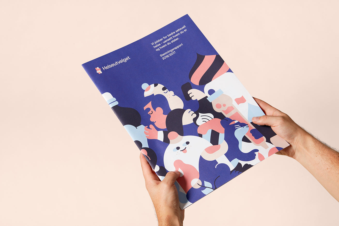
Combining illustration, information, and an easily accessible home HIV test kit, Helseutvalget completely changed Norway's approach to the disease thanks to the help of Bielke&Yang. (Photo: Design: Bielke&Yang, Illustrations: Hedof, Photos: Kimm Saatvedt and Development: Værsågod)
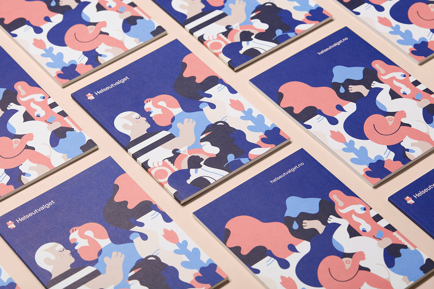
Another front-runner is independent Norwegian organization Helseutvalget, who has made it their goal to promote disease prevention in country's LGBTQ+ community. They worked with media agency Bielke&Yang to create a new visual identity, website, and printed materials all under one coherent goal.
Illustrator Hedof collaborated with Helseutvalget on the HIV test kit to disarm the content through playful illustrations. This was crucial for all parties involved to make the kit as easy to interact with as possible for those in vulnerable situations
Helseutvalget didn't want to distance themselves from their current community, so the new design had to create some inclusive and friendly ways to meet the new audience needs and also engage with the current community. To make the organization seem more approachable, Helseutvalget released a do-it-yourself HIV test for home use in 2016. This was a new and initiative approach in Norway at the time.
The new logo features an icon/ monogram that displays the letter "H" made up of two figures hugging, alongside the pink tone, this creates a more welcoming and approachable identity to the general public. (Photo: Design: Bielke&Yang, Illustrations: Hedof, Photos: Kimm Saatvedt and Development: Værsågod)
Bielke&Yang worked extensively on the new logomark, a lot of time and consideration went into the design, visual language, and letter forms. The new logo consists of two people in an embrace position, giving a welcoming appearance from the outset. Dutch illustrator Hedof collaborated with Helseutvalget on the HIV test kit to disarm the content through playful illustrations. This was crucial for all parties involved to make the kit as easy to interact with as possible for those in vulnerable situations.
The new visual identity was a huge success for Helseutvalget. They received over one thousand orders for their HIV test within a week of the launch, and their website saw a manyfold increase in unique visits. They were also recognized by leading design awards such as D&AD Awards, European Design Awards, and Visuelt.
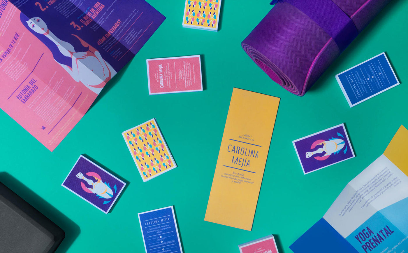
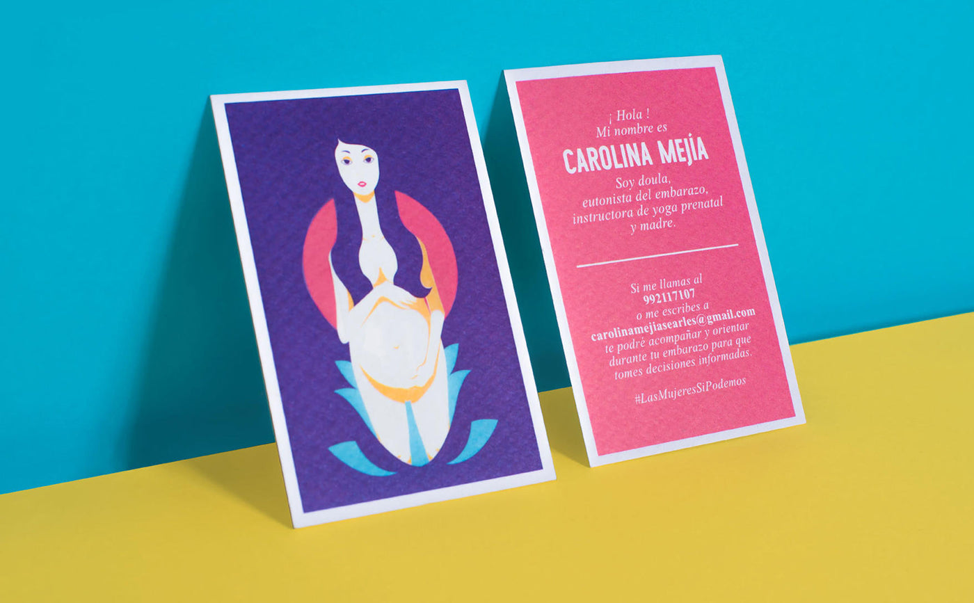
Pregnancy is a life-changing experience and women shouldn't have to go through it alone, that's why 'Carolina Mejia' was created with the help of Provincia Estudio Creativo. The aim of the character is to give guidance and advice to women in Peru. (Photo: Provincia Estudio Creativo)
Carolina is the emotional connection needed to encourage someone seeking advice
Outside of Europe, there has been plenty of other non-profit and charity success rebrands. Peruvian women support service Doulo (which translates to childbirth support person) is another organization working in new and innovative ways to reach delicate audiences. Working with Provincia Estudio Creativo on the new identity and strategy, Duolo created 'Carolina Mejia' to accompany women during pregnancy.
The playful colors and simple design approach create a relaxed atmosphere for potential patients, this is important because if the service didn't seem friendly or impartial it could result in women turning away. (Photo: Provincia Estudio Creativo)
'Carolina Mejia' is an illustration character that supports women through pregnancy. She is also a yoga teacher, mother, and pregnancy expert that acts as a personal service to women wanting to speak to someone about what they are experiencing. Carolina is the emotional connection needed to encourage someone seeking advice. The potential patient then has the option to call or email someone working within the charity for advice or consultation. The staff at the support service center work under the name 'Carolina' to make the service seem as impartial as possible.
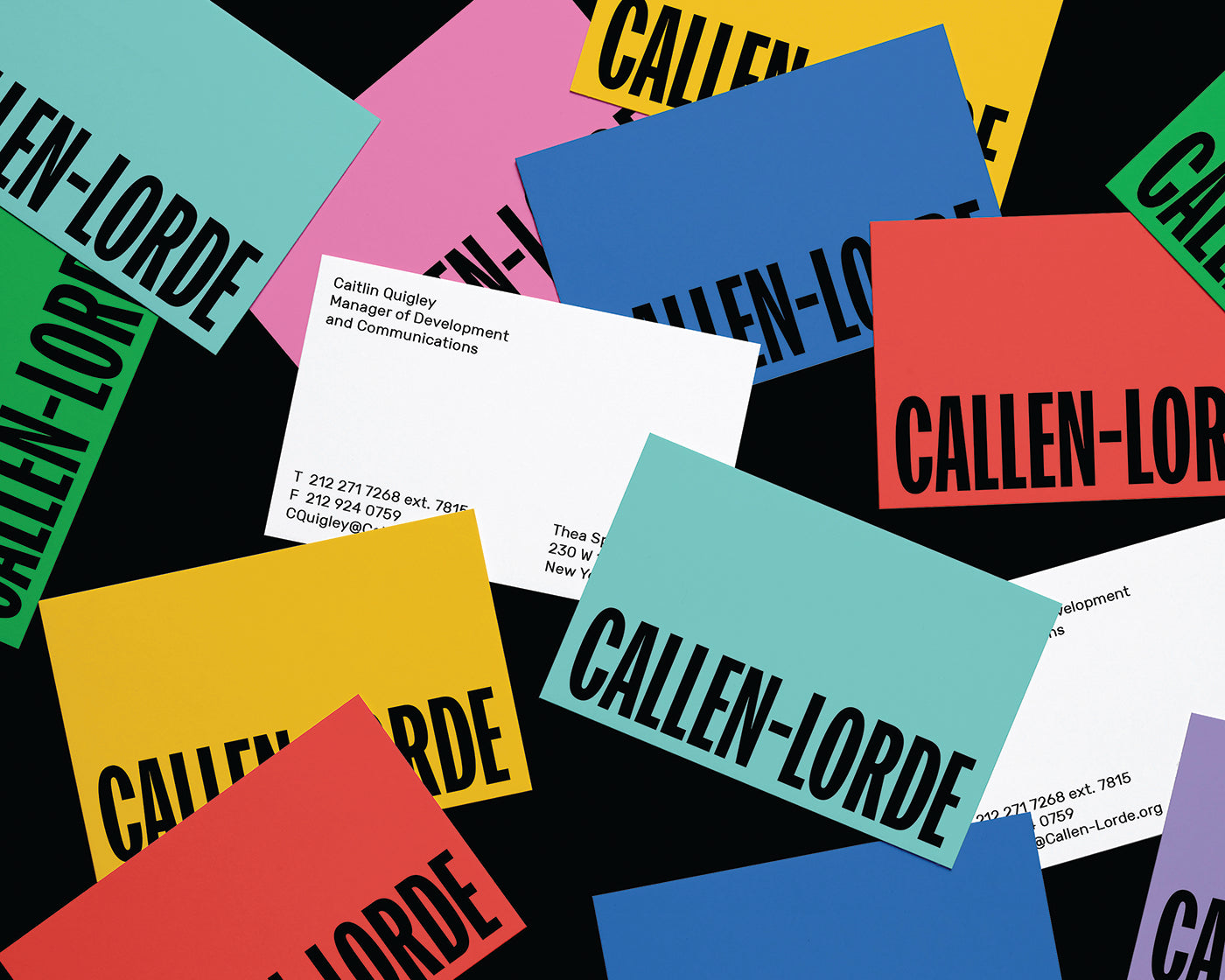
Mother and Callen-Lorde broke away from conventional branding tactics to help modernize the organization's image, while also paying respect to the history of the community and its core values
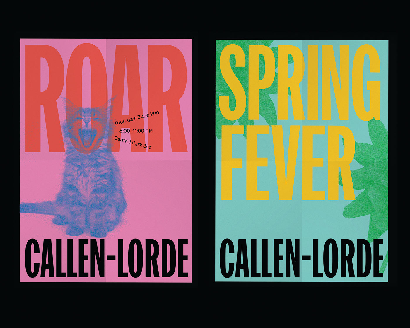
Another leader in this field is New York City's LGBTQ+ healthcare service Callen-Lorde, who is featured in our Upstart! book. For over half a century Callen-Lorde has provided outstanding comprehensive services to patients regardless of their ability to pay. They worked with advertising agency Mother Design on a new visual language that shunned the healthcare industry's stereotypical approach to medical branding.
Mother Design and Callen-Lorde challenged the cities attitude towards its cause through a powerful new visual identity that traced back to issues nearly four decades ago. (Photo: Mother Design)
Mother created a colorful brand identity that drew inspiration from 1980s guerrilla marketing. They worked with the non-profit institution to celebrate the marketing campaigns of the AIDs crisis that gripped much of the world during that period of time. The designers ended up creating a colorful identity that works effectively across signage, posters, online, and stationery materials. Mother and Callen-Lorde broke away from conventional branding tactics to help modernize the organization's image, while also paying respect to the history of the community and its core values.
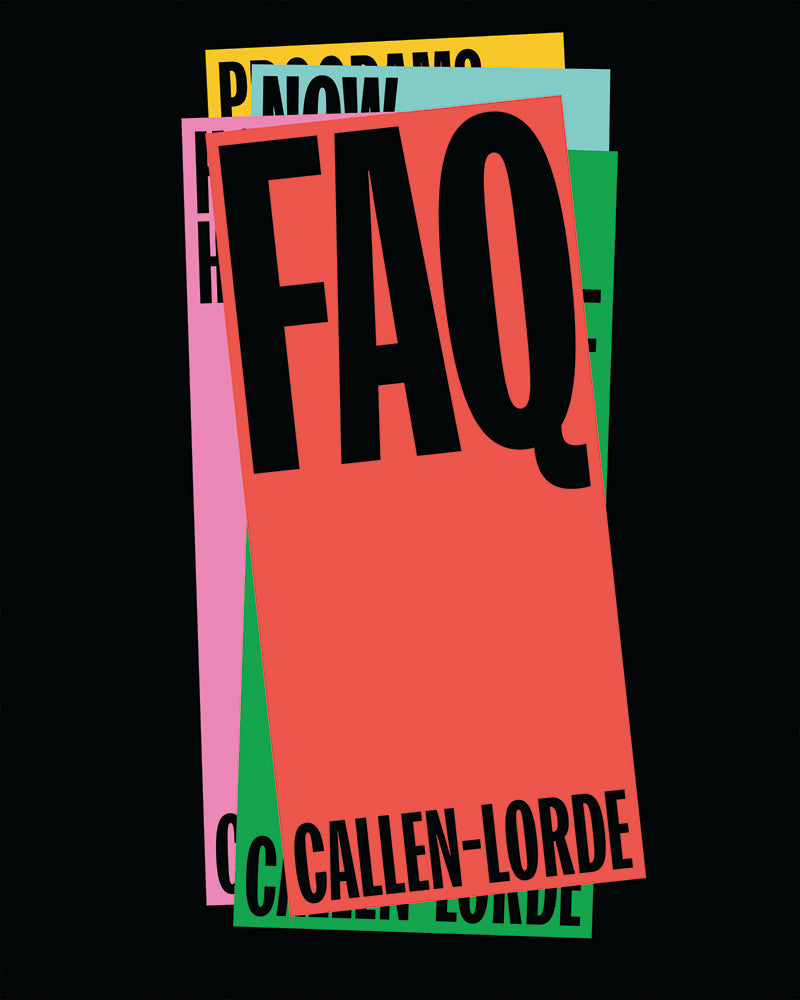
The New York-based LGBTQ+ service has been a leader for over half a century but was lacking the cutting-edge design and recognizable identity that would bring it into today's fierce and competitive charity funding market. The vibrant new identity created by Mother Design sparked new life into the organization and helped put it back into public discussion. (Photo: Mother Design)
Today's brands are many things, including creative platforms that pose between playful and professional pillars. They stir emotion and draw inspiration from everywhere, this new approach undoubtedly boosts sales but also allows us to celebrate diversity and break the glass-ceilings of the past. They not only excite us by taking us on a ride, but they also engage us and allow for a more forward-thinking environment. This new landscape has helped charities and non-profit organizations get ahead instead of being left behind. This is a breathtaking moment for society, hopefully, it allows for our advancement.
Presenting fresh branding concepts for aspiring companies around the world, read about this new phenomenon in our Upstart! book.
