A Love Affair With Typography
A tribute to Libération’s design history would not be complete without the influence of the 1970s
Since its beginnings, Libération has been characterized by a very distinctive use of typeface, to such an extent that Libé has put its mark on fonts from across different eras, appropriating these in a certain way.
The iconic newspaper launched in 1973 by a group inspired by the revolutionary spirit of Paris in 1968. The vision of its founders, which included Jean-Paul Sartre, was of a newspaper owned by its workers and committed to journalistic integrity. Taking its name from a 1941 French Resistance newspaper with ties to the Communist Party, which closed in 1964, the new daily maintained independence from any party while espousing its leftist, socially progressive position. This rebellious notion is present through the stories it covers and also the visual language it uses to connect with their demographic.
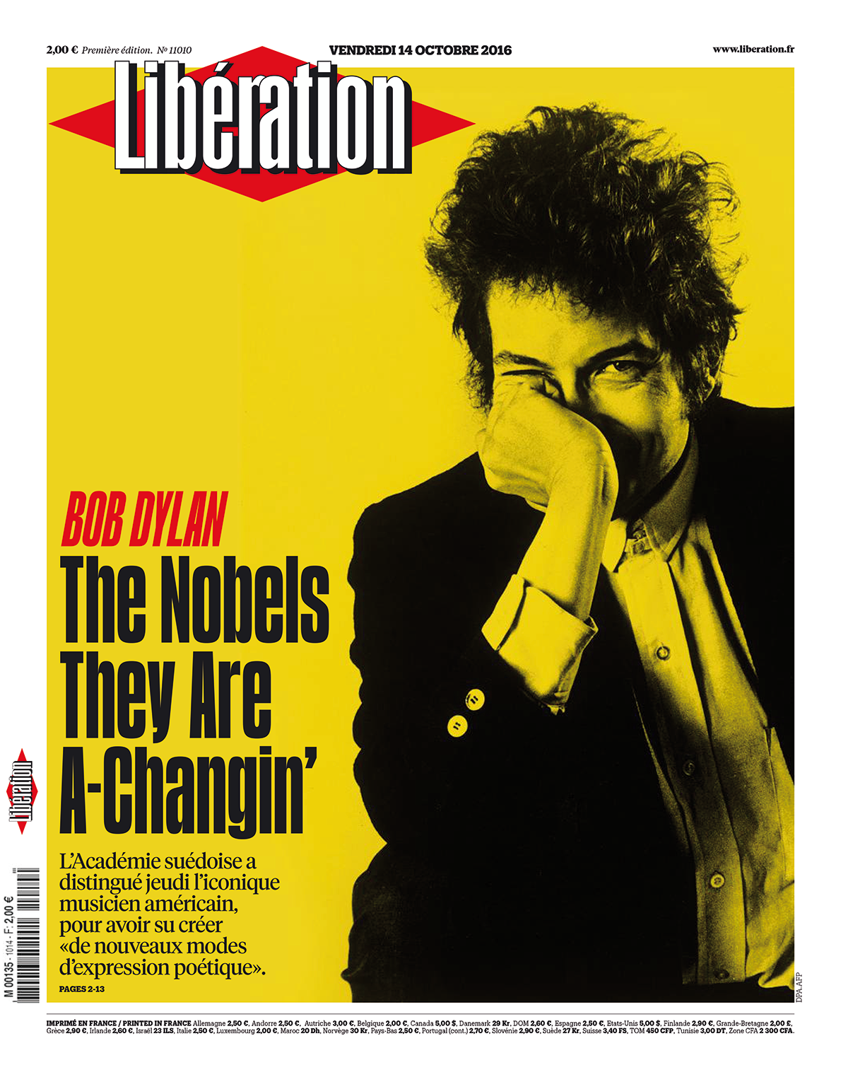
In 2016, the awarding of the Nobel Prize in Literature to Bob Dylan was an opportunity for Libération to make a play on words, in English, on its front page. The striking two-tone image is in yellow and black. (Newspaper Design)
In 1978, Claude Maggiori made the first-ever retouch to the original design and introduced American Typewriter. In 1981, he based his “Libé 2” project on Franklin Gothic Condensed. In 1994, the “Libé 3” project was built around Franklin Gothic and Bureau Eagle.
After the failure of that project, Trade Gothic was used in place of Franklin Gothic and for a decade became the default font for Libération. During those years, Matrix was used as an expressive counterpoint. In 2003, Mario García redesigned Libé and used Gotham Condensed in place of Trade Gothic, and Chronicle in place of Matrix. The original Smoothie, with its calligraphic air, was reserved for a few elements of signage and brought a note of expressiveness that had previously been missing. The 2007 project opted for a slab (Soho) that was a clear departure from the typographical traditions of the newspaper.
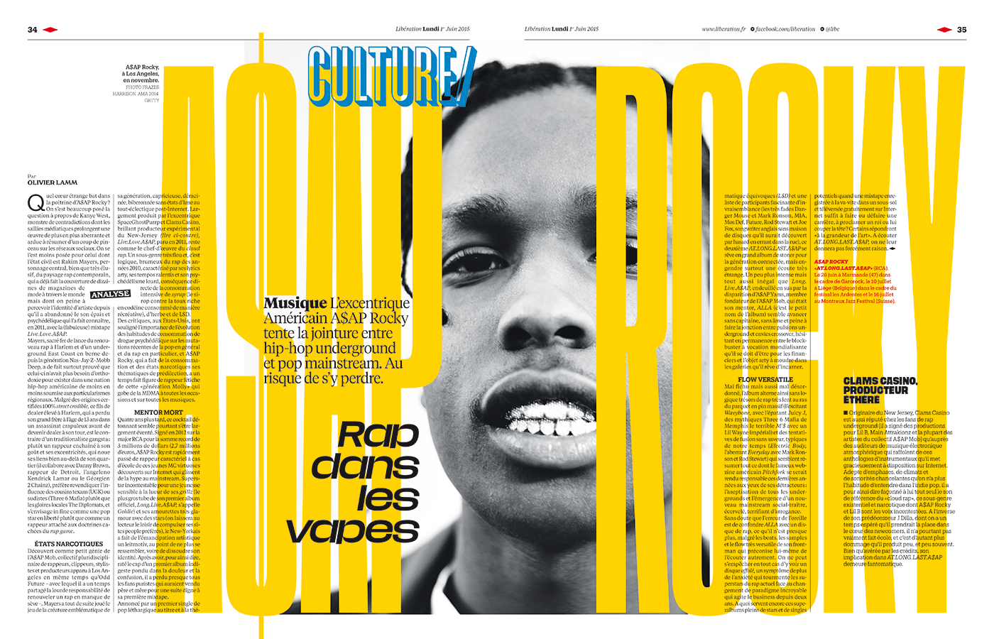
This double-page demonstrates the importance of typography as an expressive factor in Libération. The ultra- condensed variants of the Libé Sans typeface are used on a large scale and for very short headlines, becoming images in their own right. (Newspaper Design)
The 2009 redesign by Javier Errea aimed to distance the newspaper from the dominant visual aesthetics of the day. All uses of the Soho font were removed and Trade Gothic was brought back. This condensed sans-serif font is clean and neutral and became characteristic of Libé in the 1990s. Together with Trade Gothic, which was used only for the front page and major stories, Glosa Display was given a starring role. Glosa Display, in all its variations, allowed the newspaper to unfold majestically and to pace its rhythm, differentiating the hard news from other reporting and the cultural sections. For navigation, Neutraface by Christian Schwartz was used.
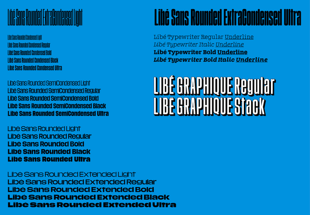
The typographical personality was also crucial to the 2015 project. Windsor was brought back for the signage on the opinion pages. Graphique Pro, a classic typeface with an outline-shadow style, became the base for the navigation system. Above all, the goal was to have typography that could be rounded and versatile, condensed, yet simultaneously expansive, thus establishing the visual temperature of the new newspaper.
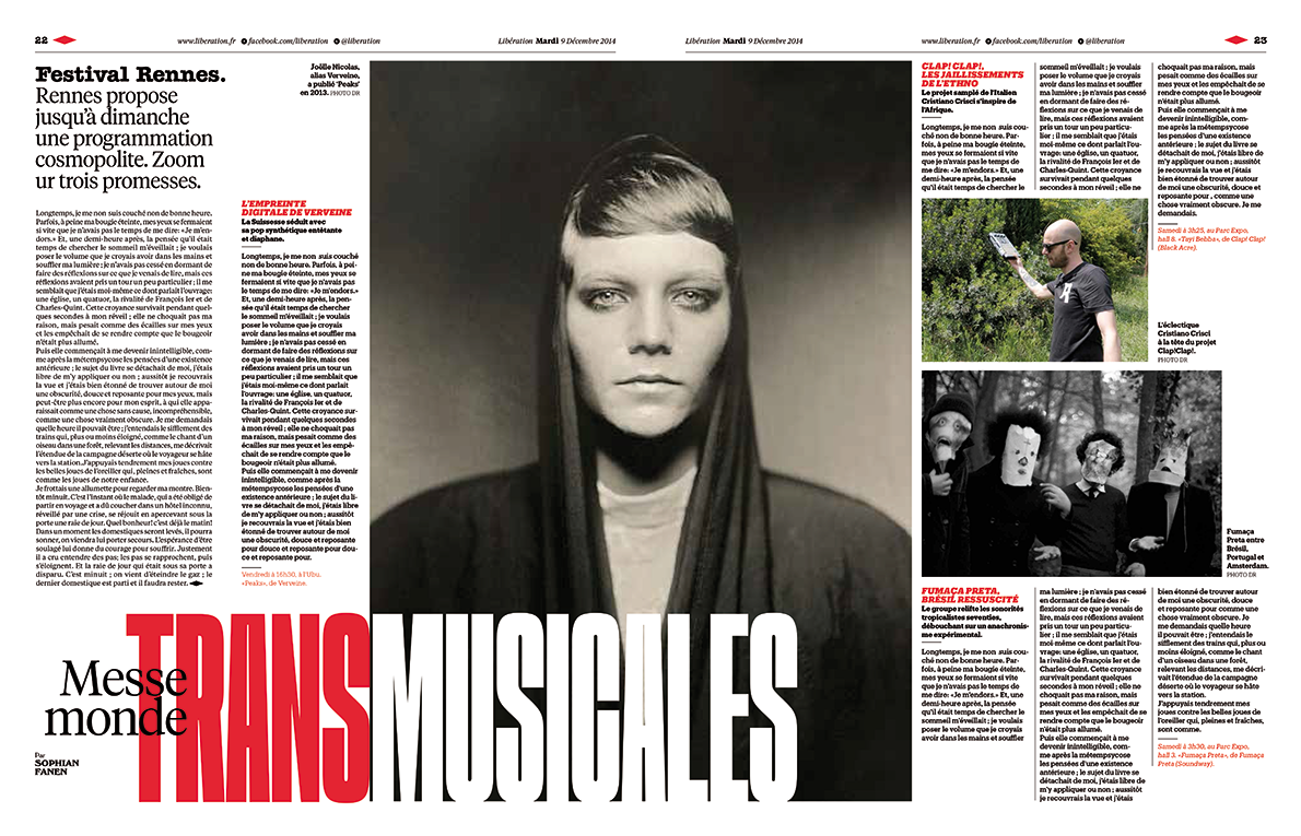
The design calls for experimenting with condensed or expanded treatments, or even combining both variants in a single headline. Lines that accentuate the paragraphs are also used frequently, to underscore headlines. These can partially encroach on the images without affecting their clarity. (Newspaper Design)
Following several tests, a family of customized and proprietary fonts was designed by Jean-Baptiste Levée of France, who designed what came to be called Libé Sans in record time. Libé Sans covers a complete arc: from an extended version to another ultra-condensed one. It also included the variations of Round, which is reserved for the weekend supplement, and Typewriter, which is used for the Next magazine and other monographic inserts.
Despite the current condition of the paper, France—and what is more, visual journalism—would not be the same without the voice of Libération.
For more about Libération approach to news visual language alongside some of the world's renowned platforms through Newspaper Design.