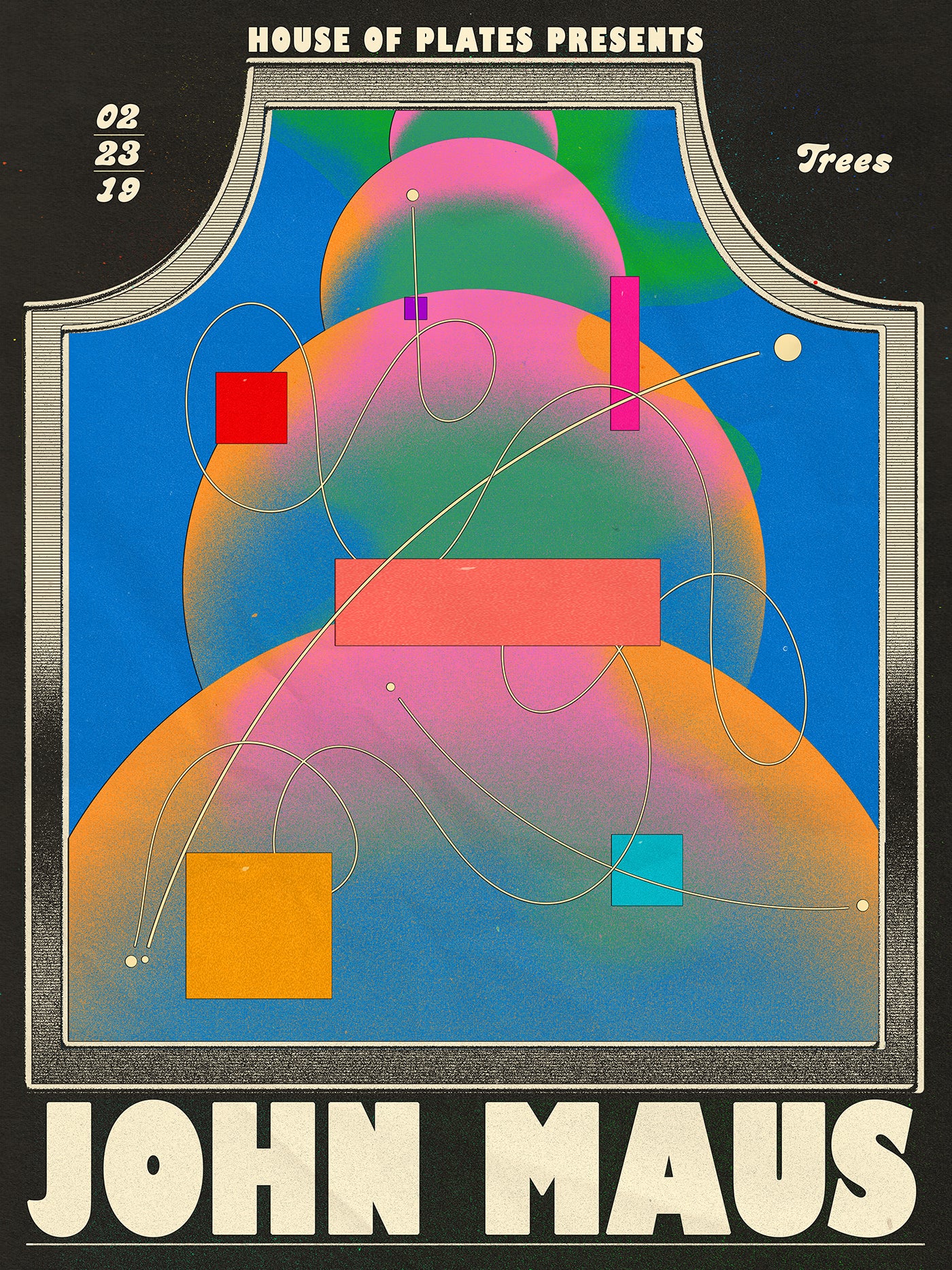
Aaron Lowell Denton's Surrealist Solar System
Romancing over album covers and posters that give an added depth to the music
When music and art become intertwined, a formula that helps enhance human senses through powerful chemistry simulates the mental faculty and inner sensations that are connected. They both have the power to move and rouse separately, but when together, they collide in a chasmic adulation of emotions. Album covers and posters can be as notorious as the chords themselves, the visuals for Joy Division’s Unknown Pleasures has more than stood the test of time and resonates with the viewer on a deeper level. Aaron Lowell Denton is the designer who is bridging this connection and has created hypnotic work for Leon Bridges, Tame Impala, Shintaro Sakamoto, and Khruangbin.
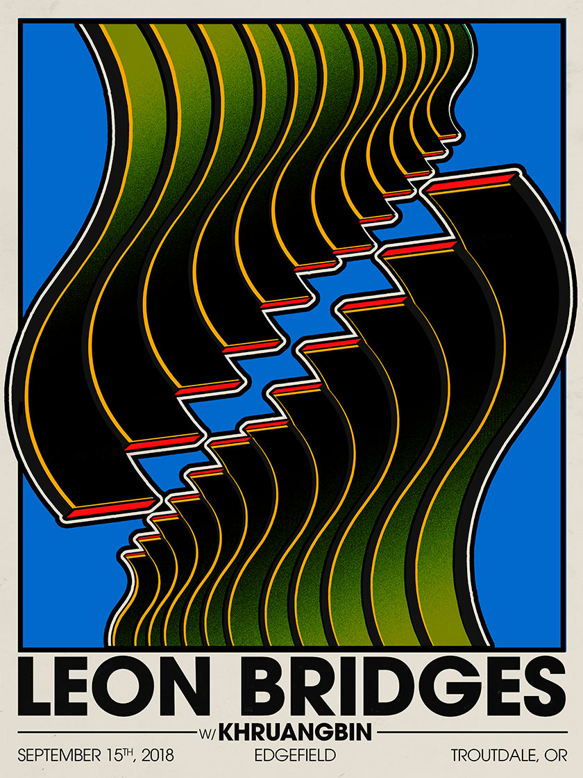
Aaron Lowell Denton's poster design for Leon Bridges show in Troutdale with Khruangbin. The minimal color scheme draws the viewer in a hypotonic fashion and encourages a deeper relationship to music and words.
The Indiana-based designer has a zealous command of color and abstraction. Possessing an experimental edge that challenges type, layout, and design—his work isn’t tied to a movement, but nostalgic references are informed within his pieces. The Art History and Literature graduate began creating art for his band while at the University of Indiana. “I was throwing local shows and trying to promote them using the software to make posters. It was never something I intended to do for a living, more just out of the necessity of not having the money to pay someone else to do it,” he tells us.
Through the power of Instagram, he received his first commission, a poster Mount Eerie show in Bloomington, Indiana. Lowell Denton recalls, “the show was being held at a unique venue, an old church that had been painted black and turned into a woodworking shop. I drew the silhouette of the church on the poster and remembered the process of finding a font that matched it nicely.”
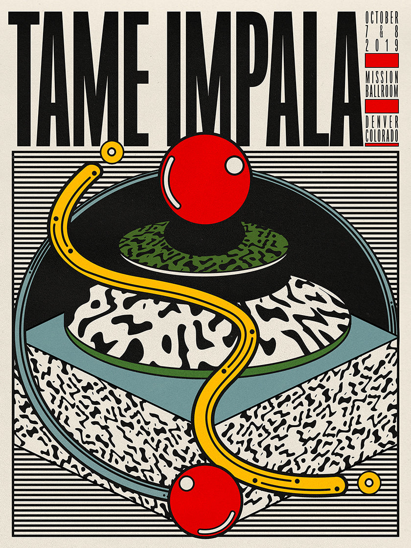
Tame Impala's poster ahead of a show in Denver. The design mood has been executed in perfect precession to match the artist's music. The clean design with references from the Memphis Movement is beautifully arrayed through the color scheme and use of lines, which is layered almost like a 3D cake.
Every design process for him is different, tailored to the artist or message within the music. His approach is always adapting as he says his understanding of what is ‘good design’ is “constantly in flux.” At present he notes Norman Rockwell as a source of influence. “I’ve been enthralled with his paintings. He's a notorious figure in American painting, kind of synonymous with banal depictions of everyday life. I've been doing more illustrative work as of late and just thinking about the relationship between art and editorial magazine work. I admire artists like him who were able to advance their artistic inclinations within the confines of commercial commissions,” he explains. Having recently stumbled across the galvanizing record sleeve for Van Morrison’s Hard Nose The Highway, he’s also recently been drawn to Rob Springett’s lucid and interdimensional artwork.
Doing his best to avoid the cliché 'everything' inspires his work, Lowell Denton explains how the mundane and ordinary can provide a fillip for his design perspective. “I saw a photo the other day on the bottom side of a lily pad. Incredible. I have a lot of small objects and trinkets around the house that serve no real function but that I like the look of. They're reminders that something can just be pleasurable to look at and that can be its function in the world. They're my cheerleaders.” His designs both reference past movements and also act as timely accolades to what he is experiencing at that moment. Lowell Denton answers questions about the depth and nature of his work.
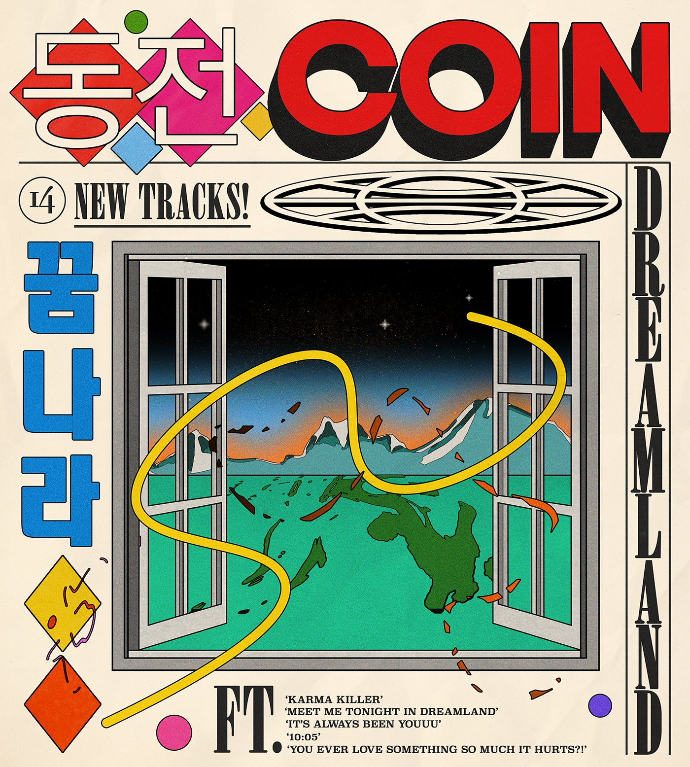
The poster for COIN’s new record, Dreamland, shows the diversity of his work. Less coordinated by the dynamic lines which are more common in his work, this particular piece acts as an escapist dream window into another reality with Japanese graphic references from the 1970s.
With Surrealist, Memphis Movement, and dreamlike characteristics, how would you describe your aesthetic to others?
Occasionally I'll be asked what style my art is and I've never known how to answer. I never think about my specific style. The aesthetics of those art movements you mention (Surrealism and Memphis) definitely have had an influence on me and I've used tools of those genres in my work, but I wouldn't call myself either of those things solely. I think finding a style is a mistake. It makes you think you're only good for one way of working and discourages exploration and experimentation. Best to leave it open to possibility because, for better or worse, whatever you do ends up conforming to the long arc of your own individual taste. There's no escaping from that. The good news is you can refine it and change it. Best to be flexible I think. Also, I'm not sure it's my word to describe what it is I'm doing. That's for others.
You've worked a lot with Leon Bridges and Tame Impala. What is your relationship like when collaborating?
I wouldn't say it's much of direct collaboration. I've done a few posters for Leon Bridges and Tame Impala, but my experience has been that you never come into direct contact with them. With artists of that level, you talk through management. I've been able to make some work I'm proud of with both of those artists but, to be honest, it feels like a product of not having enough time to really overthink it or do a bunch of revision rounds. Turnaround for posters can sometimes be very quick, and when you're an artist with a big tour commissioning unique posters every night there's a limited amount of bandwidth to art direct each one too much. I think that's the advantage of doing poster art. You tend to get to do what you want as long as it gets done on time.
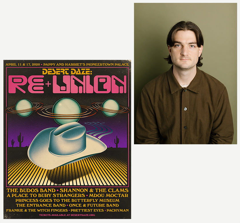 Out of this world typography for Desert Daze, RE-UNION in Pioneertown, California. The poster design was illustrated by Aaron Lowell Denton on Photoshop. The portrait was taken by Anna Powell Denton.
 Out of this world typography for Desert Daze, RE-UNION in Pioneertown, California. The poster design was illustrated by Aaron Lowell Denton on Photoshop. The portrait was taken by
 There's a hint of Jasper Johns, Donald Judd, and Abstract Expressionists in your style. Would it be fair to say these movements or individuals are influenced? If so, what is it about them that draws you in?
That's fair. I've discussed the influence of those artists in past interviews. As a teenager, I was drawn to that era of art. There's a level of romance involved in it. Pre-pop artwork is inspiring to me. I'm drawn to the conceptual nature of those artists, and their focus on the physicality and phenomenology of art-making. The color palettes of artists like Jasper Johns and Ellsworth Kelly have impacted my decision making with my own design practice.
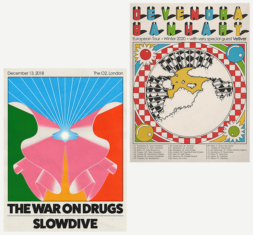
On the left, we see the poster for The War On Drugs and Slowdive's show in London. All the illustrations were designed by Aaron Lowell Denton. On the top right, we see the tour poster for Devendra Banhart and Vetiver in Europe. The letterform and Milton Glaser type reference explosively appear from the shadows and work in unison with the color scheme throughout.
Would you say your work is political? If so, what message or movement would it be tied to?
As an American, this is a difficult question to answer. In the culture here it's almost impossible to be apolitical. Whether you ignore the issue or confront it unabashedly, it feels like you're saying something. That's a product of this country's tendency to make its citizens at constant odds with one another. We're very divided and scared and that saddens me. A few years ago I worked with a group called The New Sanctuary Coalition on a poster to raise money for immigrant bail bonds. That poster said 'ABOLISH ICE' on it. That's the only time I've done work that could be considered overtly political.
You appear to be on a transition to becoming an artist. Is this something you'd like to explore going forward?
Lately, I've been asked to categorize myself quite often, which is funny. It seems when you're doing nothing it's easy to put yourself into a category, but once you start actually making things it becomes quite hard. I'm skeptical of those words, and I've struggled with defining myself as an artist. I think what you mean here is that my work is transitioning from being based in the commercial and advertising world to being more image and ideas based. I think that's true, but I also enjoy dialoguing with other forms of art in the work (writing, music, other artists). I thrive on working closely with other people on projects and having deadlines. I'm not so sure how diligent I'd be with exploring art for art’s sake types of work. I like how purposeful my work-life feels now… there's a project, a goal, an end in sight. That's a good structure to continue working a lot, and that's what I want to do.
Delve into a world of illustration and graphic design through a selection of gestalten titles.
