"Serra Was For Those That Were Curious, But Didn’t Want To Go To A Weed Shop"
Brimming with both art and agricultural references, the brand reaches out to those who, along with a good high, appreciate design that exceeds the industry standard
by Anna Sinofzik
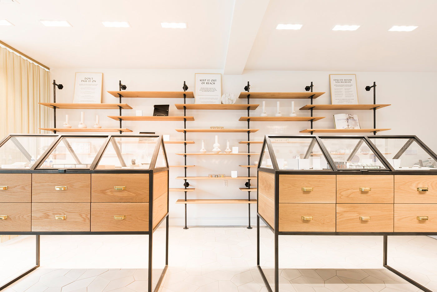
Entering a Serra boutique, one finds display cases and cabinets similar to those installed in museums and art galleries. Presented within are one-off artisanal objects produced by local creatives. Taking a decidedly artistic approach, the sophisticated pot boutique steers clear of the shady stoner image that many of its competitors cannot get out of their system.
In Italian, serra means greenhouse, but the stores of the same name present themselves in a bold blue inspired by minimal artist Yves Klein. (Photo: Half Court Studio for OMFGCO)
"We wanted Serra to be artful, from the name, to the design, to the products on our shelves," says Cambria Benson Noecker, brand director at Groundworks Industries, Serra’s parent company. She developed the strategy and positioning in close collaboration with Portland-based design firm Official Mfg. Co. (OMFGCO), whose Co-founder and Creative Director Jeremy Pelley adds: "The most important thing when developing a brand is to figure out why it exists in the first place. Everything else falls out of that."
»In a way, Serra was conceived as a gateway store for those that were curious, but didn’t want to go to a weed shop.«
According to Benson Noecker, Serra’s raison d’être was to fill a yawning gap in the market. "I had gotten into the cannabis industry through another channel and the more time I spent in that realm, the clearer it became that there wasn’t a brand or retail experience that resonated with me," she recalls. The experience she envisioned would not only break the stoner stereotype and be more attractive to a discerning clientele, but make the culture around cannabis more socially acceptable. "We wanted to create a beautiful experience that allowed our customers to be put at ease and enable them to explore cannabis," Pelley adds. "In a way, Serra was conceived as a gateway store for those that were curious, but didn’t want to go to a weed shop." With all aspects of the design, the brand’s makers wanted to push the limits of what pot culture can be.
»If they want to know what ingredients are in their skincare, why not in their cannabis?«
The vertically aligned company integrates cannabis production (through its own grow brand Pruf Cultivar), processing (through extraction and a workshop that creates its edibles), retail (through Serra and its sister brand Electric Lettuce), and distribution. The company also takes responsibility for all respective accounting, compliance, and human resource services and marketing measures.
With Serra, Groundworks Industries caters to a growing crowd of conscientious consumers. "Our customers want to know what farming method is used when they buy their produce," Benson Noecker says. "They are savvy consumers who appreciate good design and quality in all other areas. If they want to know what ingredients are in their skincare, why not in their cannabis?"
Serra means greenhouse in Italian. The 'elevated greenhouse' concept has been central to the entire visual identity–also the interior of the stores. (Photo: Half Court Studio for OMFGCO)
Serra opened three stores in 2016. By the end of the year, the progressive pot boutique had already been applauded on the pages of many of the world’s leading design magazines. "The most sophisticated cannabis dispensary in the city, if not the country," Wallpaper* wrote.
With support from multidisciplinary design firm JHL Studio in the execution, OMFGCO was responsible for the overall concept of Serra’s retail spaces, which tie in with the Italian meaning of the brand’s name. "We worked with traditional and humble materials of a greenhouse, and used them in elegant ways," Pelley explains. "For the custom shelving and display cases we chose wrought iron, wood, glass, and brass. We also tried to weave in the natural greenery of live plants into the store experience itself." The ‘elevated greenhouse’ concept has been central to the entire visual identity exploration, say the designers.
The founders of Serra wanted to create a getaway for people who were curious, but didn't want to go to a weed shop. (Photo: Half Court Studio for OMFGCO)
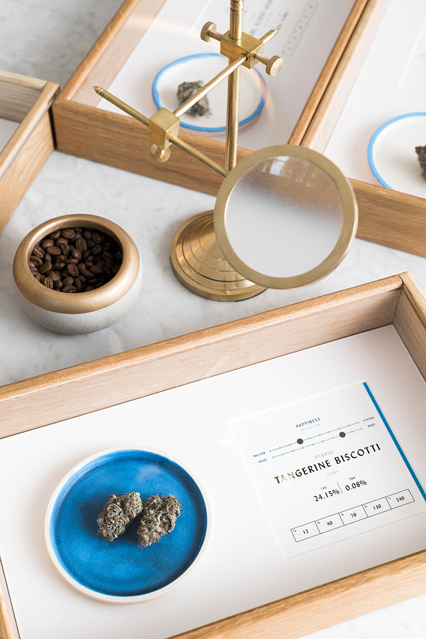
OMFGCO had some drug experience before branding Serra. In fact, it had just completed the identity for a sleek and stylish vaporizer pen called Quill, which was also designed to speak to a sophisticated pot audience too. Serra, however, was the studio’s first foray into the cannabis retail space. To facilitate the shopping experience and help newcomers navigate through the product range, the designers came up with a visual system centered around feelings. "Most cannabis shops simply lead with the technical information, which can be quite overwhelming even for the experienced smoker," Pelley argues. "Everyone knows how they want to feel though, so we figured it would be best to come up with feeling categories and create a series of graphic symbols for them. Once you know how you want to feel, these icons help guide the way to a consistent experience."
»We had lots of awkward design constraints on everything from the package design for the Serra/Woodblock chocolate bar to the space design and layout, like the required signage that we have to create for legal reasons.«
Asked about other specific challenges of designing in the cannabis industry, OMFGCO’s co-founder and creative director points to the administrative chaos it involves. "It is just the wild west right now, when it comes to the laws, rules, and regulations—things are changing constantly, and you have
to fend for yourself. We had lots of awkward design constraints on everything from the package design for the Serra/Woodblock chocolate bar to the space design and layout, like the required signage that we have to create for legal reasons. That sort of stuff is notoriously a wart on what is otherwise
a nicely designed space. You just do your best to make something amazing, regardless of all the red tape."
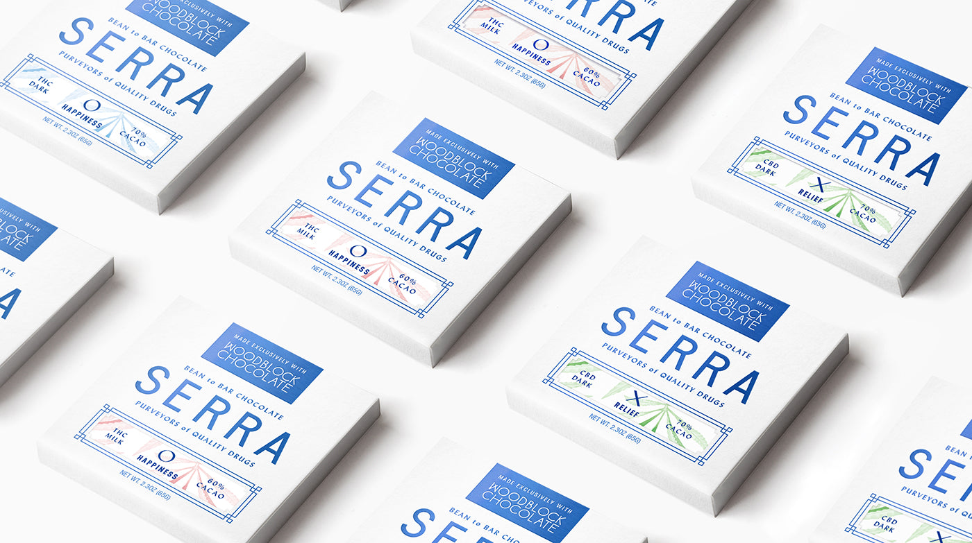
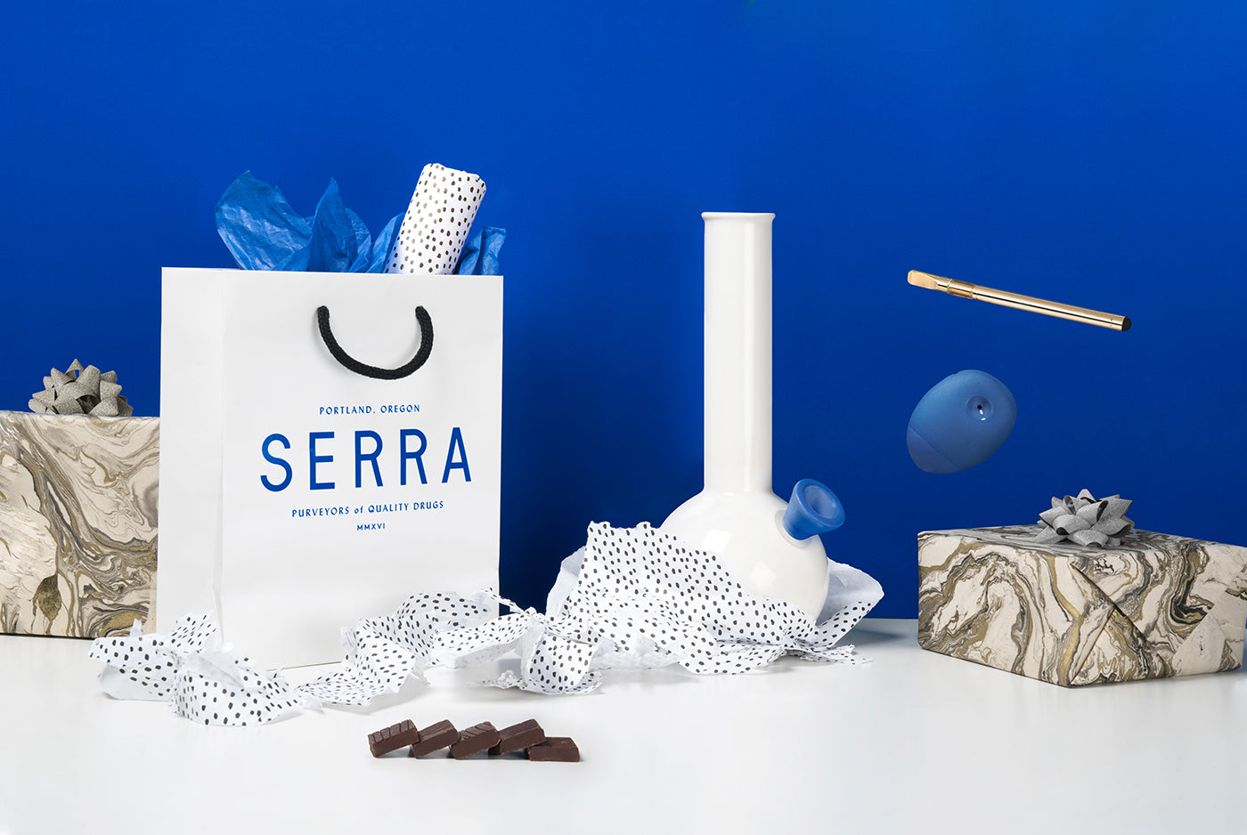
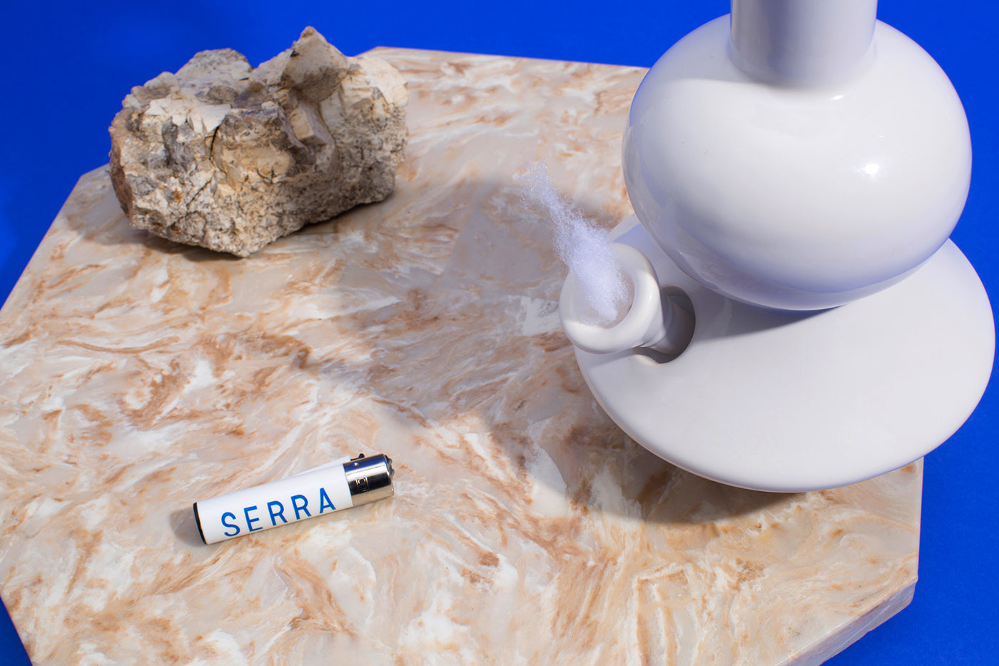
The signature color of Yves Klein inspired blue is to be seen throughout the whole product range of Serra dispensary. Here it is chocolate containing THC. (Photo: Half Court Studio for OMFGCO)
OMFGCO was nifty enough to turn the red into blue; into that strong blue very close to Yves Klein’s, which, according to Pelley, "proved to be beautiful, but a real pain in the production phase, as it was very difficult to make consistent across different mediums." It may not be one uniform shade, but variations of Serra’s signature blue crop up everywhere, from the packaging and signage, all the way to the store’s fine selection of non-pot products. Many of these items are custom-made exclusives, produced in limited editions. Benson Noecker is always keen to collaborate with local artists and designers on wearables, houseware, and smoke accessories.
The results include a series of bubble bongs by glass designer Gary Bodker, the Summerland x Serra Chongo, and an artisan clay pinch pot by Haley Ann Robinson. "I’m constantly exploring new artists through social media," Benson Noecker says. "The goal is to find or partner on pieces I would have on my shelf at home and that you shouldn’t be able to tell if it’s art or a pipe."
She shares that there are fresh product ideas in the pipeline already, as well as plans to open more Serra stores in the near future. With a new flagship Los Angeles dispensary, the brand is now beginning to expand beyond the Oregon region. "Is blue the new green?” one might ask, looking at Serra’s success. “Do we perceive reality, or do we perceive our perception of reality?" Pelley asks back, assuming the voice of a very sophisticated pothead.
This feature is an exclusive preview from Upstart!–Visual Identities for Start-Ups and New Businesses. Browse through our other book titles about visual culture.